The Curiosity Shop
The Curiosity Shop
Operational reorganization and strategic repositioning for Grupo Gallo: industrial portfolio optimization, revenue diversification into high-margin categories, and brand rejuvenation targeting Gen Z through the "Foodcore" trend
From Problem to Opportunity
Sergi’s board game shop had an outdated e-commerce website that no longer met user expectations or accessibility standards. Users faced confusing navigation, inconsistent design patterns, and outdated information, including irrelevant COVID-19 restrictions that reduced trust in the platform.
These issues created friction throughout the shopping experience, making it harder for users to navigate the website, discover products, and complete purchases with confidence. The outdated experience and lack of accessibility highlighted the need for a comprehensive redesign focused on usability, inclusivity, and business growth.
My task: Redesign the e-commerce experience into a modern, accessible, and user-centered platform that improves usability, builds trust, and creates a smoother path from product discovery to purchase using a Design Thinking approach.
The Redesign
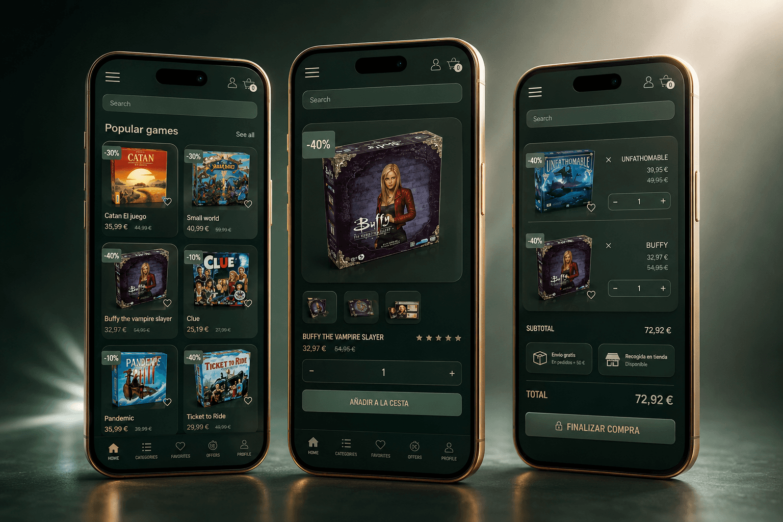
The redesign focused on creating a more intuitive, accessible, and trustworthy e-commerce experience. Navigation was simplified through a clearer information architecture and consistent interface patterns, making it easier for users to browse, discover, and find board games. Outdated content was removed and key product information was reorganized to support faster and more confident decision-making.
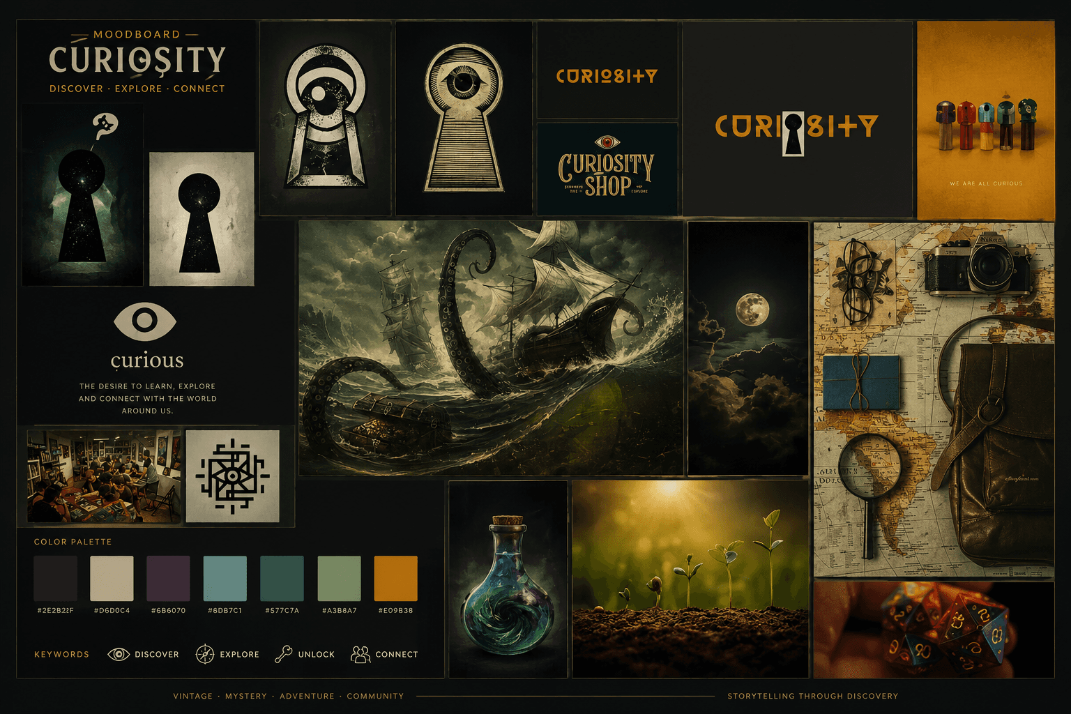
Accessibility was integrated throughout the design process, improving readability, visual hierarchy, contrast, navigation, and interaction patterns to create a more inclusive experience. The interface was also refreshed with a cohesive visual system and modern UI, creating a stronger connection between usability, accessibility, and the brand.
Designing the Solution
One of the main challenges was transforming an outdated e-commerce experience into a more accessible and intuitive platform without compromising the amount of product information users needed to make confident purchasing decisions.
Working within a small team of three and a one-week Design Thinking sprint, I conducted stakeholder interviews, heuristic evaluation, customer journey mapping, and competitor benchmarking to identify the main usability and accessibility barriers.
The research revealed inconsistent language, outdated user flows, poor navigation, and low color contrast that failed WCAG accessibility standards. These issues created unnecessary friction throughout the shopping journey and particularly affected users with visual and cognitive accessibility needs.
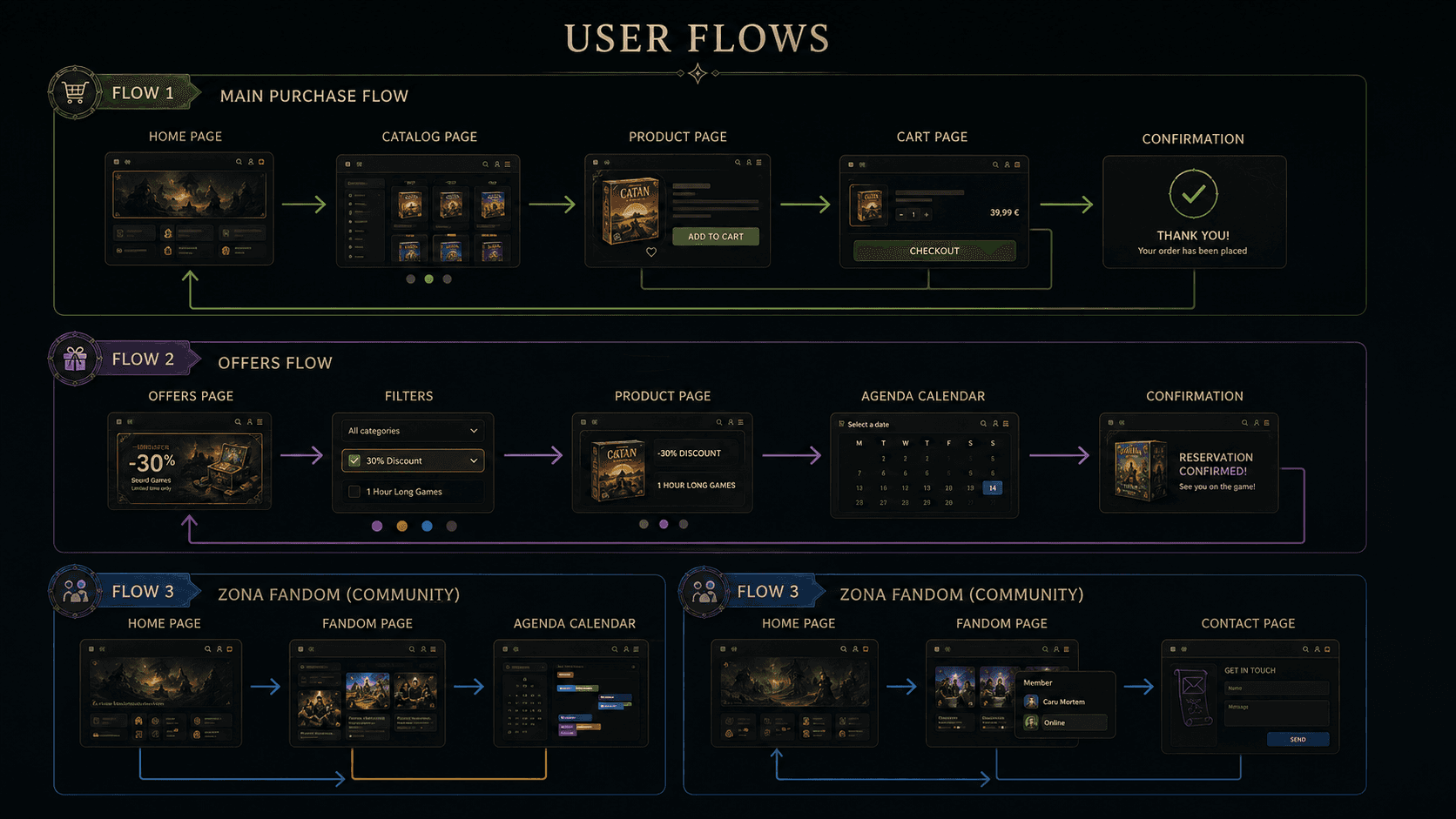
Based on these insights, I defined a clearer information architecture and developed personas, user flows, wireframes, and prototypes in Figma. The solutions were iterated through usability testing, focusing on improving visual clarity, reducing cognitive load, simplifying navigation, and creating a more inclusive purchasing experience.

A Better Shopping Experience
The redesign transformed Sergi’s outdated e-commerce website into a more accessible, intuitive, and trustworthy shopping experience. By simplifying navigation, improving information hierarchy, addressing accessibility barriers, and refining key user flows, the new experience reduced friction and made product discovery and purchasing more straightforward.
This project demonstrated how accessibility and thoughtful UX/UI design can go beyond compliance to create meaningful value for both users and businesses. By combining user research, usability principles, and strategic design decisions, the redesign created a stronger foundation for an inclusive and engaging digital experience.

The Curiosity Shop
The Curiosity Shop
Operational reorganization and strategic repositioning for Grupo Gallo: industrial portfolio optimization, revenue diversification into high-margin categories, and brand rejuvenation targeting Gen Z through the "Foodcore" trend
From Problem to Opportunity
Sergi’s board game shop had an outdated e-commerce website that no longer met user expectations or accessibility standards. Users faced confusing navigation, inconsistent design patterns, and outdated information, including irrelevant COVID-19 restrictions that reduced trust in the platform.
These issues created friction throughout the shopping experience, making it harder for users to navigate the website, discover products, and complete purchases with confidence. The outdated experience and lack of accessibility highlighted the need for a comprehensive redesign focused on usability, inclusivity, and business growth.
My task: Redesign the e-commerce experience into a modern, accessible, and user-centered platform that improves usability, builds trust, and creates a smoother path from product discovery to purchase using a Design Thinking approach.
The Redesign
The redesign focused on creating a more intuitive, accessible, and trustworthy e-commerce experience. Navigation was simplified through a clearer information architecture and consistent interface patterns, making it easier for users to browse, discover, and find board games. Outdated content was removed and key product information was reorganized to support faster and more confident decision-making.
Accessibility was integrated throughout the design process, improving readability, visual hierarchy, contrast, navigation, and interaction patterns to create a more inclusive experience. The interface was also refreshed with a cohesive visual system and modern UI, creating a stronger connection between usability, accessibility, and the brand.
Designing the Solution
One of the main challenges was transforming an outdated e-commerce experience into a more accessible and intuitive platform without compromising the amount of product information users needed to make confident purchasing decisions.
Working within a small team of three and a one-week Design Thinking sprint, I conducted stakeholder interviews, heuristic evaluation, customer journey mapping, and competitor benchmarking to identify the main usability and accessibility barriers.
The research revealed inconsistent language, outdated user flows, poor navigation, and low color contrast that failed WCAG accessibility standards. These issues created unnecessary friction throughout the shopping journey and particularly affected users with visual and cognitive accessibility needs.
Based on these insights, I defined a clearer information architecture and developed personas, user flows, wireframes, and prototypes in Figma. The solutions were iterated through usability testing, focusing on improving visual clarity, reducing cognitive load, simplifying navigation, and creating a more inclusive purchasing experience.
A Better Shopping Experience
The redesign transformed Sergi’s outdated e-commerce website into a more accessible, intuitive, and trustworthy shopping experience. By simplifying navigation, improving information hierarchy, addressing accessibility barriers, and refining key user flows, the new experience reduced friction and made product discovery and purchasing more straightforward.
This project demonstrated how accessibility and thoughtful UX/UI design can go beyond compliance to create meaningful value for both users and businesses. By combining user research, usability principles, and strategic design decisions, the redesign created a stronger foundation for an inclusive and engaging digital experience.
The Curiosity Shop
The Curiosity Shop
Operational reorganization and strategic repositioning for Grupo Gallo: industrial portfolio optimization, revenue diversification into high-margin categories, and brand rejuvenation targeting Gen Z through the "Foodcore" trend
From Problem to Opportunity
Sergi’s board game shop had an outdated e-commerce website that no longer met user expectations or accessibility standards. Users faced confusing navigation, inconsistent design patterns, and outdated information, including irrelevant COVID-19 restrictions that reduced trust in the platform.
These issues created friction throughout the shopping experience, making it harder for users to navigate the website, discover products, and complete purchases with confidence. The outdated experience and lack of accessibility highlighted the need for a comprehensive redesign focused on usability, inclusivity, and business growth.
My task: Redesign the e-commerce experience into a modern, accessible, and user-centered platform that improves usability, builds trust, and creates a smoother path from product discovery to purchase using a Design Thinking approach.
The Redesign
The redesign focused on creating a more intuitive, accessible, and trustworthy e-commerce experience. Navigation was simplified through a clearer information architecture and consistent interface patterns, making it easier for users to browse, discover, and find board games. Outdated content was removed and key product information was reorganized to support faster and more confident decision-making.
Accessibility was integrated throughout the design process, improving readability, visual hierarchy, contrast, navigation, and interaction patterns to create a more inclusive experience. The interface was also refreshed with a cohesive visual system and modern UI, creating a stronger connection between usability, accessibility, and the brand.
Designing the Solution
One of the main challenges was transforming an outdated e-commerce experience into a more accessible and intuitive platform without compromising the amount of product information users needed to make confident purchasing decisions.
Working within a small team of three and a one-week Design Thinking sprint, I conducted stakeholder interviews, heuristic evaluation, customer journey mapping, and competitor benchmarking to identify the main usability and accessibility barriers.
The research revealed inconsistent language, outdated user flows, poor navigation, and low color contrast that failed WCAG accessibility standards. These issues created unnecessary friction throughout the shopping journey and particularly affected users with visual and cognitive accessibility needs.
Based on these insights, I defined a clearer information architecture and developed personas, user flows, wireframes, and prototypes in Figma. The solutions were iterated through usability testing, focusing on improving visual clarity, reducing cognitive load, simplifying navigation, and creating a more inclusive purchasing experience.
A Better Shopping Experience
The redesign transformed Sergi’s outdated e-commerce website into a more accessible, intuitive, and trustworthy shopping experience. By simplifying navigation, improving information hierarchy, addressing accessibility barriers, and refining key user flows, the new experience reduced friction and made product discovery and purchasing more straightforward.
This project demonstrated how accessibility and thoughtful UX/UI design can go beyond compliance to create meaningful value for both users and businesses. By combining user research, usability principles, and strategic design decisions, the redesign created a stronger foundation for an inclusive and engaging digital experience.