Evolution of the International Symbol of Accessibility
Towards an Inclusive Representation of Invisible Disabilities
GRAPHIC DESIGN

Part 1: The Historical Symbol and Its Hidden Limitations
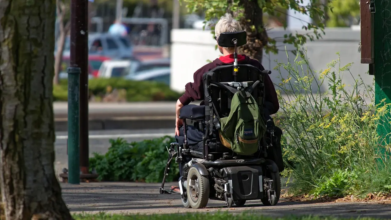
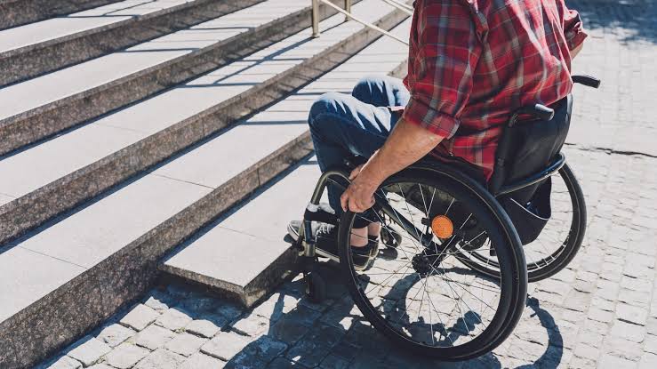
"The International Symbol of Accessibility," represented by a blue square with the stylized figure of a person in a wheelchair in white, has contributed to shaping the general perception that disability is limited to reduced mobility or the use of wheelchairs.
This narrow focus on physical mobility has influenced how society understands disability, ignoring the diversity of conditions it encompasses, such as visual, auditory, cognitive disabilities, and others. It is essential to recognize that disability takes many forms and is not always visible at first glance. In fact, most disabilities are invisible.
The “International Symbol of Accessibility” has played a crucial role in identifying areas adapted for people with disabilities, but it can also reinforce limited stereotypes about what it means to have a disability. This symbol is part of ISO 7001 standards and is protected by copyright from the International Commission on Technology and Accessibility, a committee of Rehabilitation International. As we evaluate urban signaling and inclusive architecture in 2026, the rigidity of this decades-old icon increasingly collides with modern definitions of human neurodiversity and non-apparent conditions.
Part 2: The Evolution Towards Dynamic Empowerment
The evolution of the International Symbol of Accessibility reflects an innovative and progressive approach to disability representation. Adjustments made to the original logo have transformed its dynamics and message, conveying a sense of activity and empowerment.
The forward position of the head suggests that the person is proactive and makes decisions about their mobility, empowering those living with disabilities to be active agents in their own lives. Additionally, the extended arm backward evokes a sense of movement and progression, highlighting the idea that life with a disability is not static but involves continuous exploration and advancement.
The display of this project at the Museum of Modern Art in New York underscores its cultural significance and relevance in the fields of design and accessibility. As part of the museum’s permanent collection of architecture and design, the new ISA is recognized as a significant contribution to the evolution of inclusive design and the representation of disability in contemporary society.
However, in recent design discourses, even this active wheelchair design is recognized as an incomplete solution it modernizes the posture of mobility but leaves all non wheelchair using individuals entirely out of the visual narrative.
Part 3: Beyond Visibility – Neurodiversity and Invisible Realities
While initiatives like Hidden Disabilities distinguish between visible and invisible disabilities, the solution should go beyond that. It is common for people not to understand that an invisible disability can also be physical. Autism, for example, is a condition that takes place in the brain, not a metaphysical term like belonging to a zodiac sign such as “Aquarius.” It is essential that perceptions of disabilities go beyond mere visibility and recognize the physical and concrete reality of conditions like autism.
Replacing the international symbol of accessibility with a more abstract one would have several social implications:
Inclusion: It could be perceived as an effort to represent the diversity of disabilities beyond physical limitations,fostering greater inclusion.
Education and Awareness: A change in the symbol could require education campaigns to ensure it remains effective and recognizable, potentially increasing awareness of both visible and invisible disabilities and accessibility.
Stigma and Representation: An abstract design could help eliminate stigmas associated with disability by not focusing on the physical condition but rather on the concept of accessibility.
Adoption and Normalization: The transition to a new symbol would require time and efforts for its normalization and global adoption, affecting long-term signage and accessibility policies.
Technology and Flexibility: With the 2026 integration of dynamic smart-signage and physical-digital infrastructure, an abstract design could incorporate technology, such as QR codes, NFC proximity tags, or AR spatial overlays, providing additional real-time information and enhancing the experience for people with diverse disabilities.


Part 4: Abstract Visual Representation and AI Design Frontiers
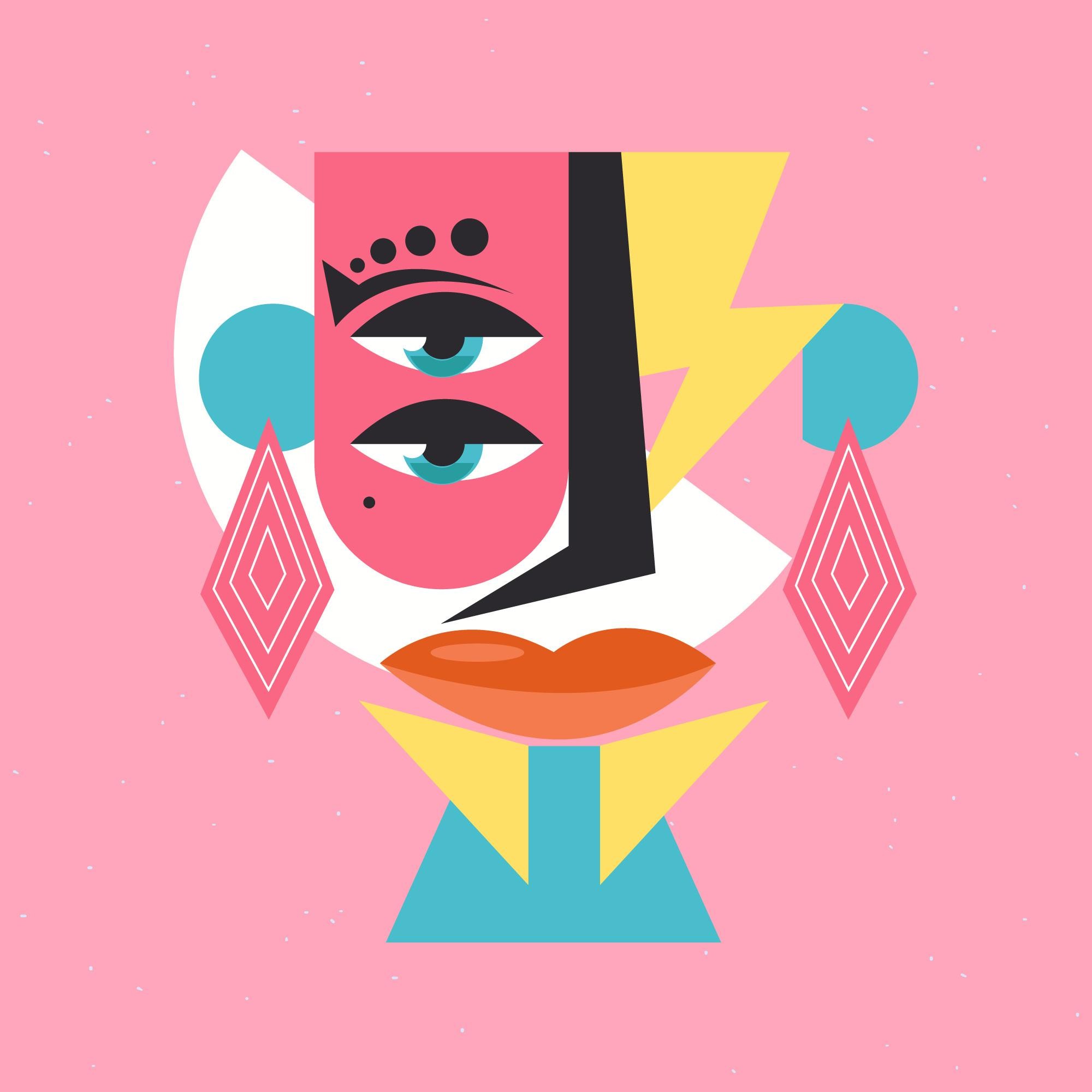
Using an abstract image with basic and colorful shapes to represent the spectrum of disabilities can convey a powerful message of inclusion and diversity. This visual approach could help break stereotypes and prejudices by emphasizing the wide range of experiences and realities within the spectrum of disabilities.
By using basic shapes and vibrant colors, the idea that disabilities are not limited to a single form or color but are diverse and multifaceted can be conveyed. Furthermore, opting for an abstract representation avoids direct association with a specific disability, allowing the image to be inclusive and accessible to people with different experiences and perspectives.
This abstract visual representation can serve as an invitation to reflect on the idea that diversity is a natural and beautiful part of the human condition. As generative design tools and AI become central to visual communication, creating modular, spectrum-based universal signage allows universal accessibility to be visually felt rather than restrictively categorized.
I have generated the image using AI with the prompt: “Abstract accessibility symbol, geometric forms, vibrant spectrum colors, inclusive, universal design.”

More to Discover

Evolution of the International Symbol of Accessibility
Towards an Inclusive Representation of Invisible Disabilities
GRAPHIC DESIGN
Part 1: The Historical Symbol and Its Hidden Limitations
"The International Symbol of Accessibility," represented by a blue square with the stylized figure of a person in a wheelchair in white, has contributed to shaping the general perception that disability is limited to reduced mobility or the use of wheelchairs.
This narrow focus on physical mobility has influenced how society understands disability, ignoring the diversity of conditions it encompasses, such as visual, auditory, cognitive disabilities, and others. It is essential to recognize that disability takes many forms and is not always visible at first glance. In fact, most disabilities are invisible.
The “International Symbol of Accessibility” has played a crucial role in identifying areas adapted for people with disabilities, but it can also reinforce limited stereotypes about what it means to have a disability. This symbol is part of ISO 7001 standards and is protected by copyright from the International Commission on Technology and Accessibility, a committee of Rehabilitation International. As we evaluate urban signaling and inclusive architecture in 2026, the rigidity of this decades-old icon increasingly collides with modern definitions of human neurodiversity and non-apparent conditions.
Part 2: The Evolution Towards Dynamic Empowerment
The evolution of the International Symbol of Accessibility reflects an innovative and progressive approach to disability representation. Adjustments made to the original logo have transformed its dynamics and message, conveying a sense of activity and empowerment.
The forward position of the head suggests that the person is proactive and makes decisions about their mobility, empowering those living with disabilities to be active agents in their own lives. Additionally, the extended arm backward evokes a sense of movement and progression, highlighting the idea that life with a disability is not static but involves continuous exploration and advancement.
The display of this project at the Museum of Modern Art in New York underscores its cultural significance and relevance in the fields of design and accessibility. As part of the museum’s permanent collection of architecture and design, the new ISA is recognized as a significant contribution to the evolution of inclusive design and the representation of disability in contemporary society.
However, in recent design discourses, even this active wheelchair design is recognized as an incomplete solution it modernizes the posture of mobility but leaves all non wheelchair using individuals entirely out of the visual narrative.
Part 3: Beyond Visibility – Neurodiversity and Invisible Realities
While initiatives like Hidden Disabilities distinguish between visible and invisible disabilities, the solution should go beyond that. It is common for people not to understand that an invisible disability can also be physical. Autism, for example, is a condition that takes place in the brain, not a metaphysical term like belonging to a zodiac sign such as “Aquarius.” It is essential that perceptions of disabilities go beyond mere visibility and recognize the physical and concrete reality of conditions like autism.
Replacing the international symbol of accessibility with a more abstract one would have several social implications:
Inclusion: It could be perceived as an effort to represent the diversity of disabilities beyond physical limitations,fostering greater inclusion.
Education and Awareness: A change in the symbol could require education campaigns to ensure it remains effective and recognizable, potentially increasing awareness of both visible and invisible disabilities and accessibility.
Stigma and Representation: An abstract design could help eliminate stigmas associated with disability by not focusing on the physical condition but rather on the concept of accessibility.
Adoption and Normalization: The transition to a new symbol would require time and efforts for its normalization and global adoption, affecting long-term signage and accessibility policies.
Technology and Flexibility: With the 2026 integration of dynamic smart-signage and physical-digital infrastructure, an abstract design could incorporate technology, such as QR codes, NFC proximity tags, or AR spatial overlays, providing additional real-time information and enhancing the experience for people with diverse disabilities.
Part 4: Abstract Visual Representation and AI Design Frontiers
Using an abstract image with basic and colorful shapes to represent the spectrum of disabilities can convey a powerful message of inclusion and diversity. This visual approach could help break stereotypes and prejudices by emphasizing the wide range of experiences and realities within the spectrum of disabilities.
By using basic shapes and vibrant colors, the idea that disabilities are not limited to a single form or color but are diverse and multifaceted can be conveyed. Furthermore, opting for an abstract representation avoids direct association with a specific disability, allowing the image to be inclusive and accessible to people with different experiences and perspectives.
This abstract visual representation can serve as an invitation to reflect on the idea that diversity is a natural and beautiful part of the human condition. As generative design tools and AI become central to visual communication, creating modular, spectrum-based universal signage allows universal accessibility to be visually felt rather than restrictively categorized.
I have generated the image using AI with the prompt: “Abstract accessibility symbol, geometric forms, vibrant spectrum colors, inclusive, universal design.”
More to Discover
Evolution of the International Symbol of Accessibility
Towards an Inclusive Representation of Invisible Disabilities
GRAPHIC DESIGN
Part 1: The Historical Symbol and Its Hidden Limitations
"The International Symbol of Accessibility," represented by a blue square with the stylized figure of a person in a wheelchair in white, has contributed to shaping the general perception that disability is limited to reduced mobility or the use of wheelchairs.
This narrow focus on physical mobility has influenced how society understands disability, ignoring the diversity of conditions it encompasses, such as visual, auditory, cognitive disabilities, and others. It is essential to recognize that disability takes many forms and is not always visible at first glance. In fact, most disabilities are invisible.
The “International Symbol of Accessibility” has played a crucial role in identifying areas adapted for people with disabilities, but it can also reinforce limited stereotypes about what it means to have a disability. This symbol is part of ISO 7001 standards and is protected by copyright from the International Commission on Technology and Accessibility, a committee of Rehabilitation International. As we evaluate urban signaling and inclusive architecture in 2026, the rigidity of this decades-old icon increasingly collides with modern definitions of human neurodiversity and non-apparent conditions.
Part 2: The Evolution Towards Dynamic Empowerment
The evolution of the International Symbol of Accessibility reflects an innovative and progressive approach to disability representation. Adjustments made to the original logo have transformed its dynamics and message, conveying a sense of activity and empowerment.
The forward position of the head suggests that the person is proactive and makes decisions about their mobility, empowering those living with disabilities to be active agents in their own lives. Additionally, the extended arm backward evokes a sense of movement and progression, highlighting the idea that life with a disability is not static but involves continuous exploration and advancement.
The display of this project at the Museum of Modern Art in New York underscores its cultural significance and relevance in the fields of design and accessibility. As part of the museum’s permanent collection of architecture and design, the new ISA is recognized as a significant contribution to the evolution of inclusive design and the representation of disability in contemporary society.
However, in recent design discourses, even this active wheelchair design is recognized as an incomplete solution it modernizes the posture of mobility but leaves all non wheelchair using individuals entirely out of the visual narrative.
Part 3: Beyond Visibility – Neurodiversity and Invisible Realities
While initiatives like Hidden Disabilities distinguish between visible and invisible disabilities, the solution should go beyond that. It is common for people not to understand that an invisible disability can also be physical. Autism, for example, is a condition that takes place in the brain, not a metaphysical term like belonging to a zodiac sign such as “Aquarius.” It is essential that perceptions of disabilities go beyond mere visibility and recognize the physical and concrete reality of conditions like autism.
Replacing the international symbol of accessibility with a more abstract one would have several social implications:
Inclusion: It could be perceived as an effort to represent the diversity of disabilities beyond physical limitations,fostering greater inclusion.
Education and Awareness: A change in the symbol could require education campaigns to ensure it remains effective and recognizable, potentially increasing awareness of both visible and invisible disabilities and accessibility.
Stigma and Representation: An abstract design could help eliminate stigmas associated with disability by not focusing on the physical condition but rather on the concept of accessibility.
Adoption and Normalization: The transition to a new symbol would require time and efforts for its normalization and global adoption, affecting long-term signage and accessibility policies.
Technology and Flexibility: With the 2026 integration of dynamic smart-signage and physical-digital infrastructure, an abstract design could incorporate technology, such as QR codes, NFC proximity tags, or AR spatial overlays, providing additional real-time information and enhancing the experience for people with diverse disabilities.
Part 4: Abstract Visual Representation and AI Design Frontiers
Using an abstract image with basic and colorful shapes to represent the spectrum of disabilities can convey a powerful message of inclusion and diversity. This visual approach could help break stereotypes and prejudices by emphasizing the wide range of experiences and realities within the spectrum of disabilities.
By using basic shapes and vibrant colors, the idea that disabilities are not limited to a single form or color but are diverse and multifaceted can be conveyed. Furthermore, opting for an abstract representation avoids direct association with a specific disability, allowing the image to be inclusive and accessible to people with different experiences and perspectives.
This abstract visual representation can serve as an invitation to reflect on the idea that diversity is a natural and beautiful part of the human condition. As generative design tools and AI become central to visual communication, creating modular, spectrum-based universal signage allows universal accessibility to be visually felt rather than restrictively categorized.
I have generated the image using AI with the prompt: “Abstract accessibility symbol, geometric forms, vibrant spectrum colors, inclusive, universal design.”